
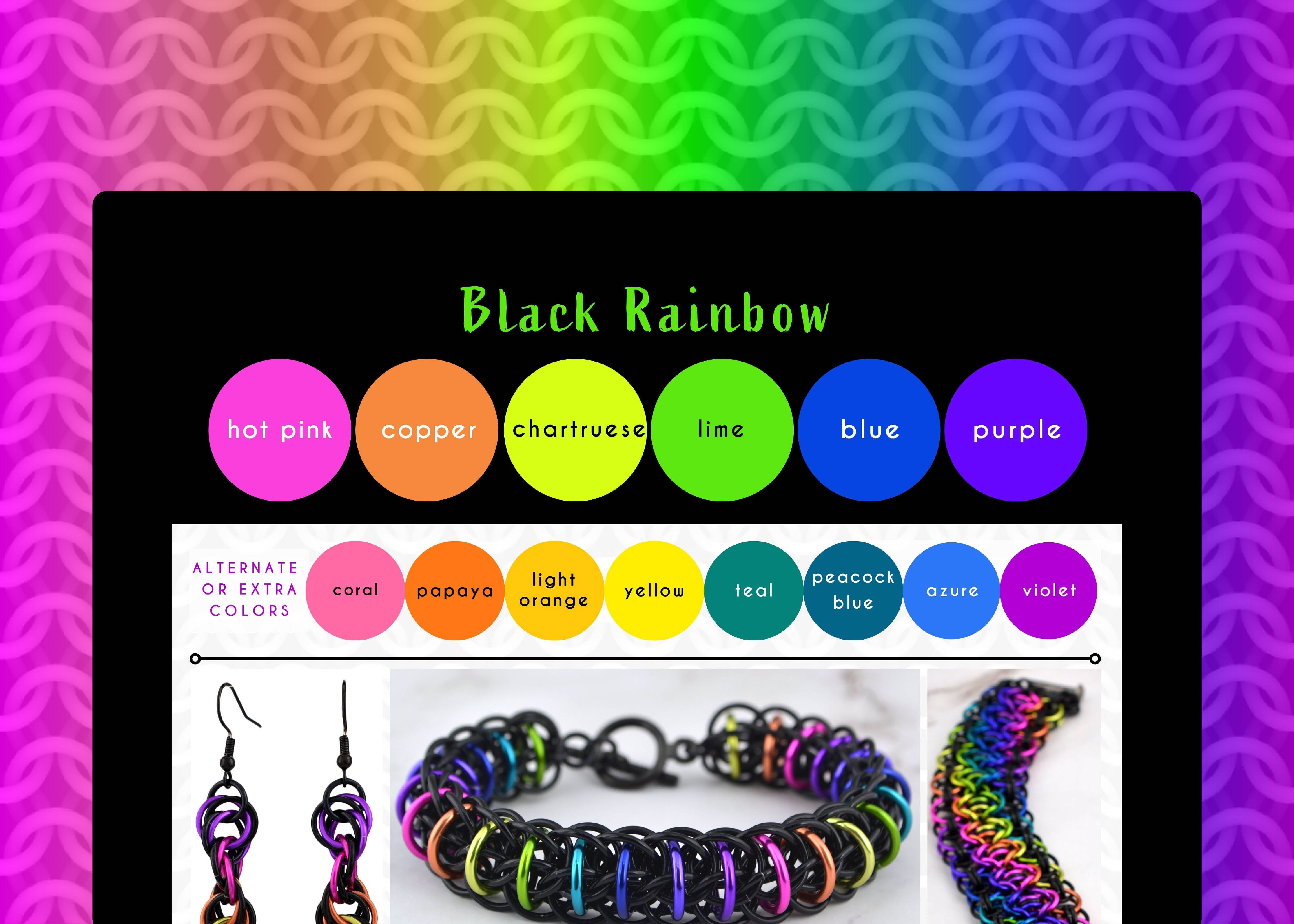
Black Rainbow Color Palette - Black Light Poster Vibes
My goal with this palette was to channel those psychedelic black-light art posters! This is a bold, eye-catching colorway that brings a fun, high-energy retro vibe to every piece.

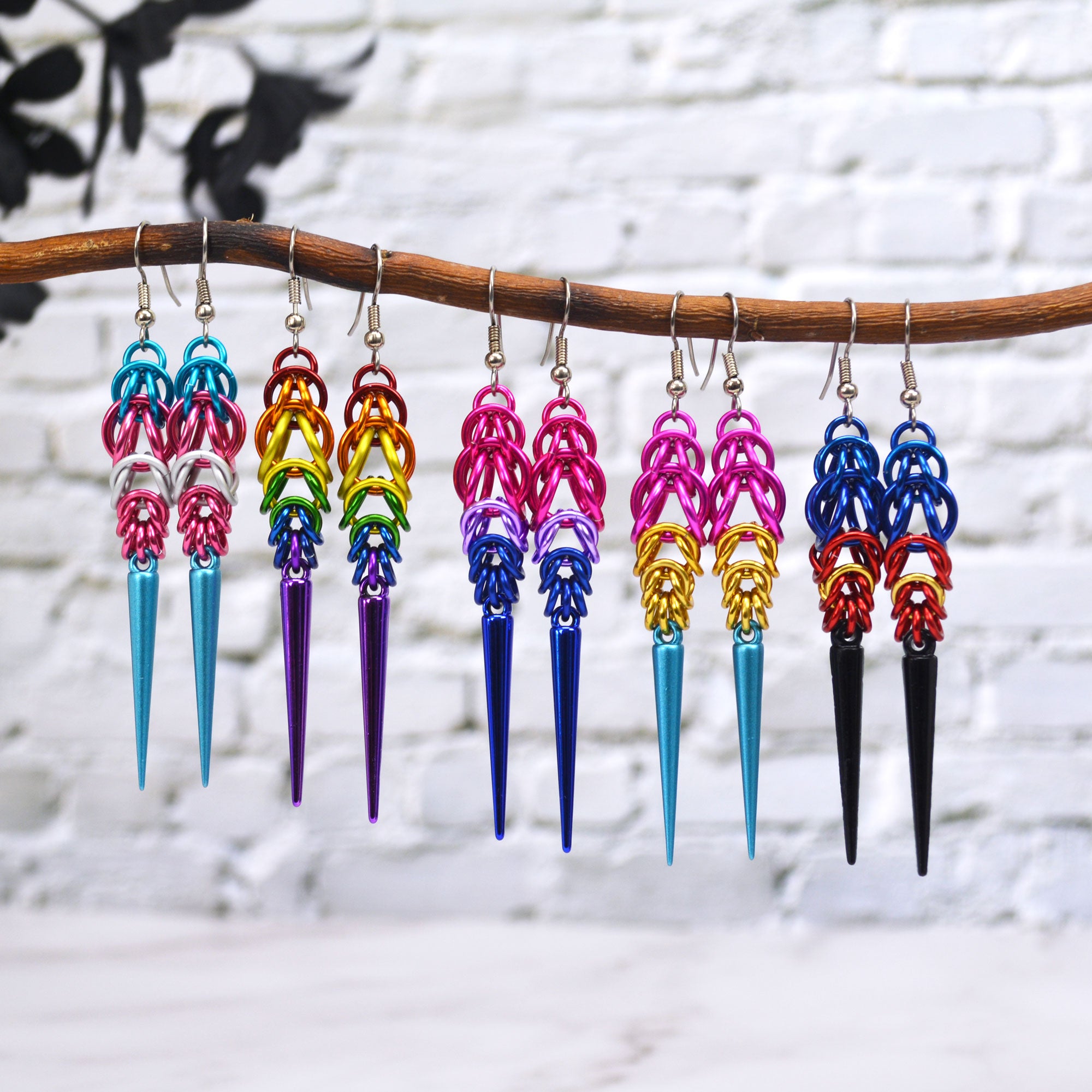
Shown in the graphic, starting from upper left and moving clockwise: Helix Earrings, Firewyrm Bracelet, Rondo a la Byzantine Bracelet, Viperscale 2.0 Bracelet
Hues That Pop
The Black Rainbow colorway features vibrant, fluorescent-like tones framed with pure black. Deep blue and purple create depth, a sort of transitional layer between the in-your-face bright colors and the receded black background.
The colors I typically use:
- standard colors: hot pink, copper chartreuse, lime, blue, and purple
- alternate and extra colors: coral, papaya, light orange, yellow, teal, peacock blue, azure, violet
- background: black
The main swatches are a starting point, and depending on dye lots, I’ll also incorporate some of the alternate colors, or even shades not listed here. If creating an ombre, especially one that cycles more than once (as in hte bracelets), I’ll almost always include violet as a critical transition color between purple and hot pink.
As you can see, I almost always use this palette as an ombre (to be honest, I can’t think of a single time I’ve just mixed them together!) It’s just too good as an ombre!
Why Black Makes the Rainbow Shine Brighter
Framing these colors in black allows the palette to stand out with an almost three-dimensional effect. The absence of light in the black links forces the eye to focus solely on the intense brightness of the rainbow rings.
While I often use shiny black rings, choosing links with a matte black finish can make the vibrant colors pop even more. It's a subtle but powerful touch that heightens the contrast.
The darkest colors in the rainbow—the blue and purple—add one more layer of visual texture. This creates an undulating effect: the colors approach and recede in waves according to how dark they are, giving the finished piece a sense of lively movement.
💡 Scientifically, the strong contrast between the dark black and the near-fluorescent rings heightens the perceived luminosity of the bright colors, making them appear even brighter.
This palette is very similar to Electric Rainbow.

The main difference is the addition of orange-tone colors, and the absence of a bright aqua/turquoise hue. The inclusion of the warmer hues creates a more cohesive, full-spectrum cycle that transitions smoothly across the entire color wheel. I prefer to stay away from using a pure, bright orange, and instead use copper or papaya, as I feel those colors work best to transition between hot pink and chartreuse, and—at least to my eye—they work best with the black links.
If you've got a keen eye, you may have noticed that—especially with the absence of red—more than half of the colors in Black Rainbow have a cool undertone. This is a subtle nod to the physics of black light itself, as true black light is in the blue/purple ultraviolet spectrum.
Love these colors? Most long designs can be customized with the Black Rainbow colorway, or you can create your own masterpiece with a custom DIY kit from Blue Buddha Boutique in this palette. Contact me and let's bring your vision to life!
Follow this series on the dedicated Color Palette board on Pinterest.
Leave a comment
This site is protected by hCaptcha and the hCaptcha Privacy Policy and Terms of Service apply.