
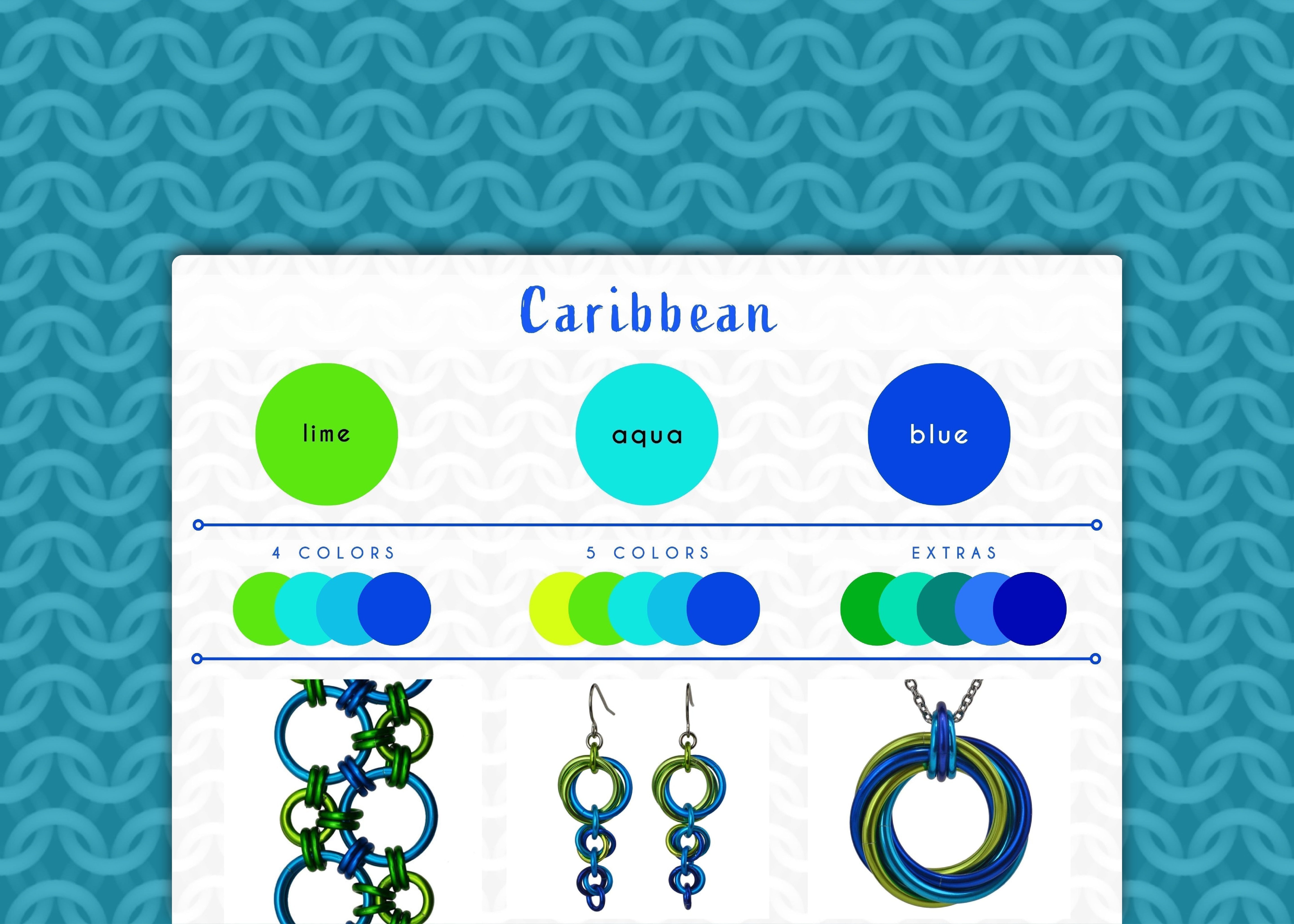
Caribbean Color Palette - A Splash of Paradise
Lime, aqua and blue combine into a refreshing tropical paradise in the Caribbean color palette. When creating this palette, I closed my eyes and tried to remember what it was like spending childhood holidays at the Seven Seas beach in my father’s homeland of Puerto Rico. I imagined the deep blues of the ocean on the horizon transitioning to a lighter aqua near the shore. Splashes of bright green—both seaweed in the water as well as palm fronds on the beach—stood out against the cool blues of the water. (Or, as an adult, maybe the lime color comes from a mojito, because hey, why not!)

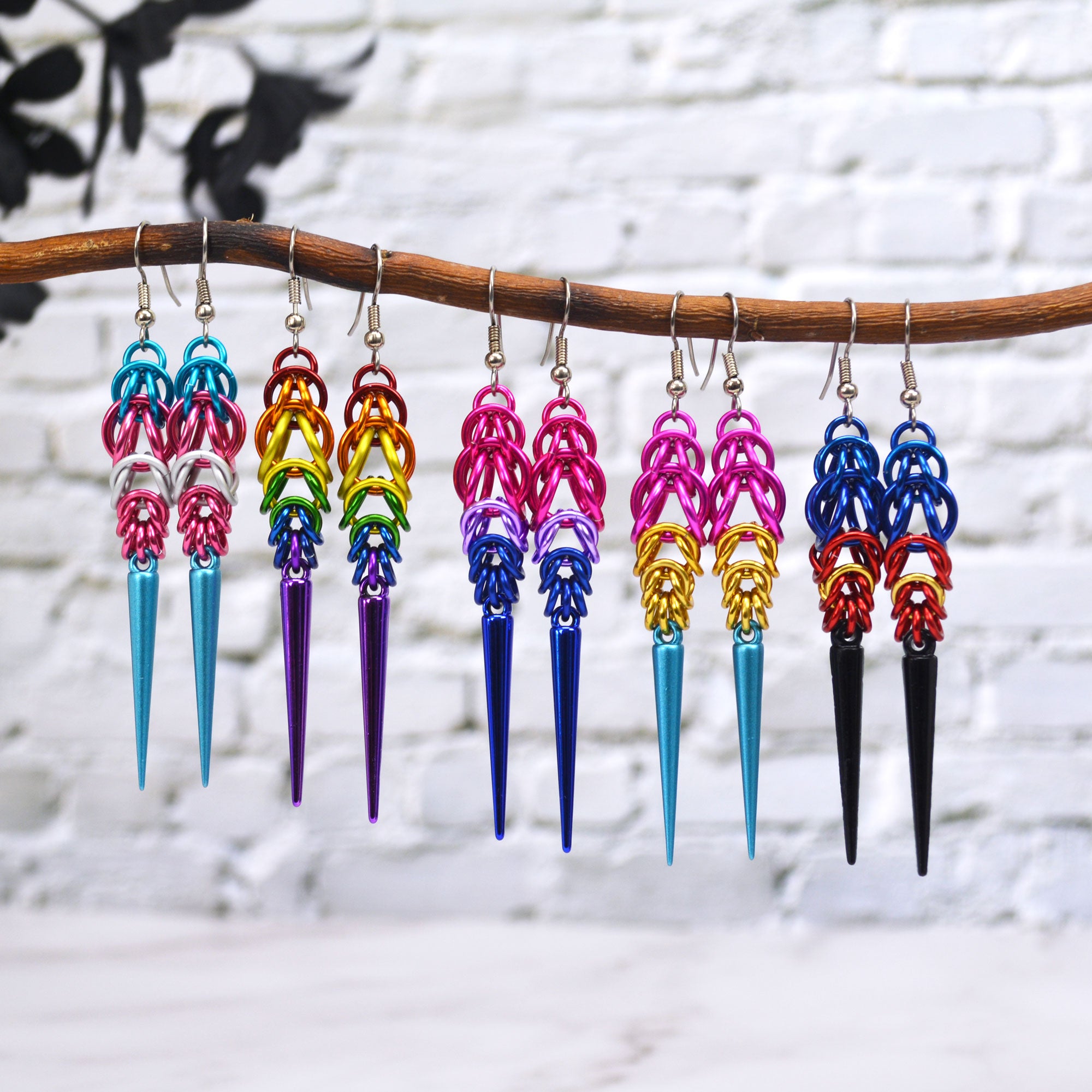
Shown in the collage, starting from upper left and moving clockwise: Hodo Bracelet, Comet Earrings, Swirl Pendant, Cascading Leaves Long Earrings, Dodecahedrons
Caribbean Colors
- main colors: lime, aqua, blue
- 4-color ombre: lime aqua, turquoise blue
- 5-color ombre: chartreuse, lime, aqua, turquoise, blue
- extras colors that can be added: green, light teal, teal, azure, dark blue
In the 3-color version, I'll occasionally substitute chartreuse or green instead of lime, depending on the dye lots and customer preferences. (The Swirl Pendant and Cascading Leaves Earrings in the graphic above use chartreuse.)
Compare this color palette to Water/Deep Blue Sea and you’ll notice how much more refreshing and uplifting Caribbean is. Both palettes use blue—the obvious color of water—which represents tranquility and calmness. However Caribbean contains aqua, a bright hue with a slight green undertone that is inherently more “energetic” than blue or turquoise. Finally, lime brings extra vitality and freshness to the Caribbean palette. The brightness of aqua and lime contrast against blue, keeping the palette from becoming too serene and adding a pop of playfulness and zest.
With this palette, I’ve tried to convey feelings of relaxation, adventure and joy - a sense of escape that you can enjoy no matter what the temperatures of your surroundings are. It's a personal escape, a wearable representation of the perfect tropical day.
Love these colors? Any item in my shop can be customized with the Caribbean colorway, or you can create your own masterpiece with a custom DIY kit from Blue Buddha Boutique in this palette. Contact me and let's bring your vision to life!
Follow this series on the dedicated Color Palette board on Pinterest.
Leave a comment
This site is protected by hCaptcha and the hCaptcha Privacy Policy and Terms of Service apply.