
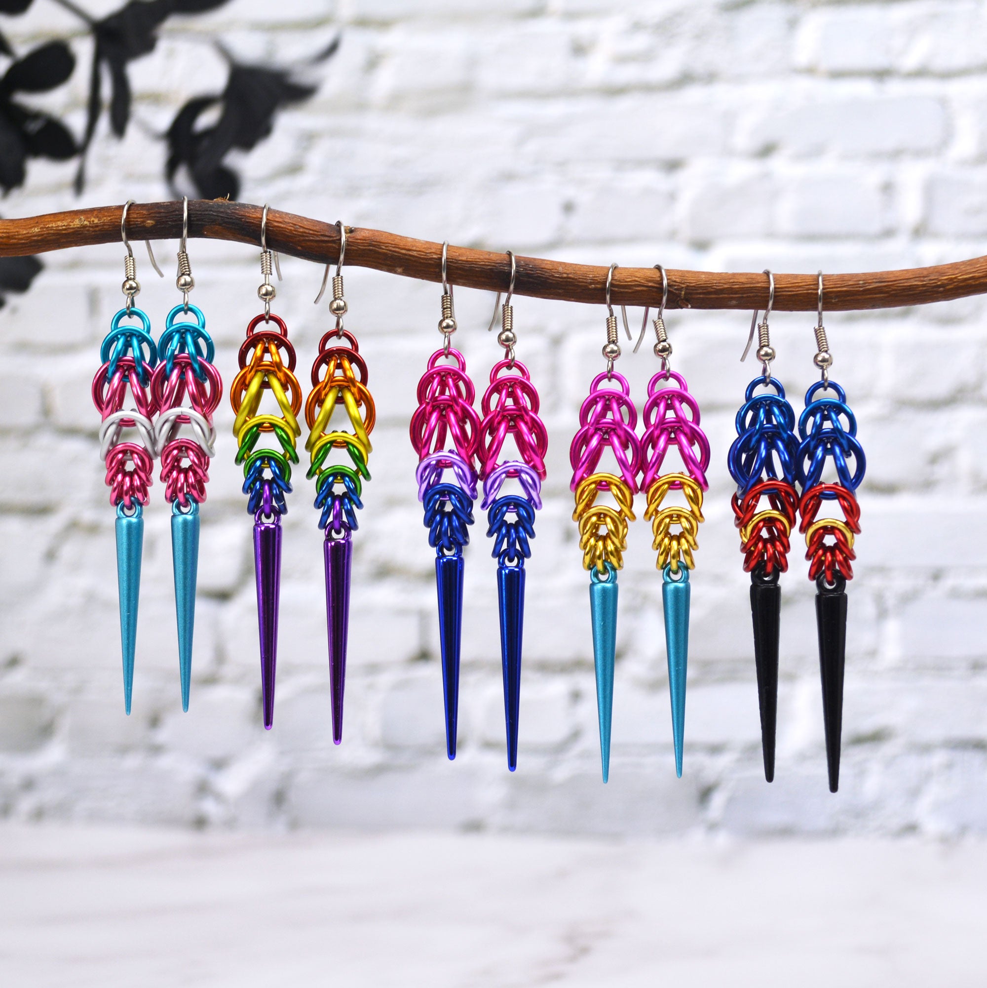
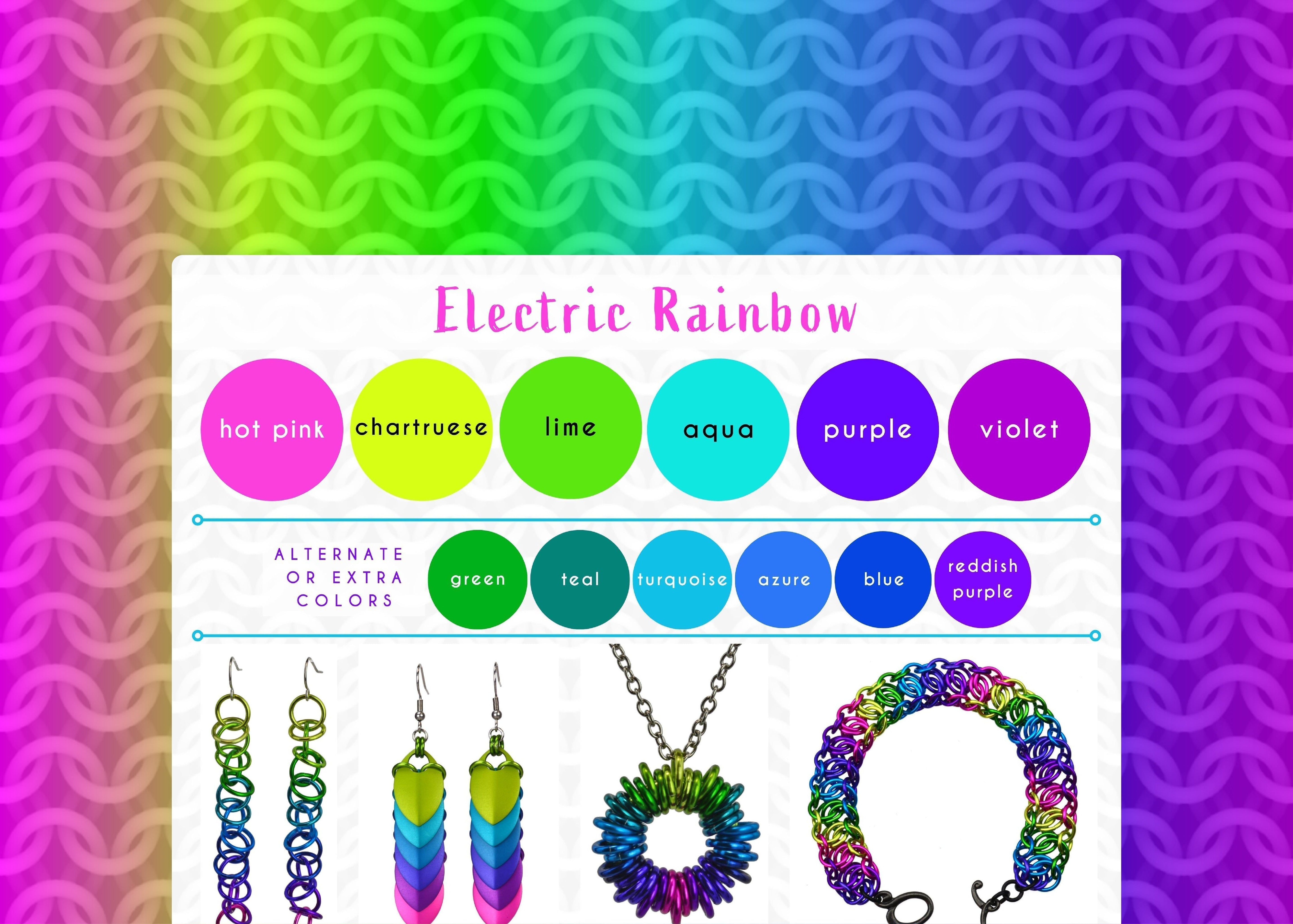
Electric Rainbow Color Palette - 80s Neon Vibes
Turn up the volume with the Electric Rainbow palette, a super-charged, eye-popping explosion of color that screams 80s neon and high-voltage energy. While these colors can be used in a vibrant confetti mix, my absolute favorite way to showcase the main 6 colors is in an ombre, as you can see in most of the examples below.

Shown in the graphic, starting from upper left and moving clockwise: Orbital Earrings, Chevron Earrings, Coiled Pendant, Mngwa Bracelet, Spike Earrings, Fringe Earrings (Shaggy Loops), Viperscale 2.0 Bracelet
- standard colors: hot pink, chartreuse, lime, aqua, purple and violet
- alternate and extra colors: green, teal, turquoise, azure, blue, reddish purple
Individually, many of these colors are already "electric" (we're looking at you, hot pink and chartreuse). Combine them, and they become even more intensely vibrant, generating energy as your eye jumps from one bright color to the next.
While the entire palette is designed to be high-impact, it can also create a flowing gradient. The coiled rainbow pendant, for instance, is still incredibly bright but seems less "loud" due to a more gentle transition between colors and a focus on calming blues. This piece adds many of the alternate/extra colors, using a minimum of 10 different hues to achieve its comprehensive and flowing ombre.
The Science Behind the Glow: Powering Up The Palette
So, what makes these colors seem so much brighter and more "electric" than their more subdued counterparts? It often comes down to saturation and luminosity. Colors like lime are highly saturated, meaning they are pure and intense, without much gray or black mixed in. They also tend to have a higher luminosity, which refers to how much light they reflect or appear to emit. Think about the difference between a pastel pink and a hot pink: the hot pink is loaded with pure, vibrant pigment, making it "loud" and attention-grabbing.
In the world of dyes and pigments (yes, anodized aluminum gets its color from dye), achieving these glowing, almost fluorescent effects often involves specific types of colorants that reflect light more intensely, giving them that characteristic "neon" quality. When these highly saturated, luminous colors are placed next to each other, especially in an ombre, they amplify each other's brilliance, and play off one another. This effect is especially pronounced between hot pink and chartreuse, not only because they are individually bright, but also because they are near opposites on the traditional color wheel. (Opposites such as red/green or blue/yellow and purple/orange create strong visual contrast when placed side by side.)
Combining all these bright colors into one piece makes for a dynamic and visually stimulating experience — you can almost hear the colors they are so loud!
Love this bold palette? Many items in my shop can be customized with the Electric Rainbow colorway, or you can create your own masterpiece with a custom DIY kit from Blue Buddha Boutique in this palette. Contact me and let's bring your vision to life!
Follow this series on the dedicated Color Palette board on Pinterest.
1 comment
Why can’t you sell these gorgeous rings? The colours are all fantastic!!!
———
Rebeca Mojica Jewelry replied:
I’m so glad you love all the colors! I stopped manufacturing years ago (my passion lies in creating and teaching chainmaille, not in dealing with the manufacturing side of things … you could say I’m a weaver, not a spinner! 😉) I still do offer a few kits, including custom-color ones, on the Blue Buddha Boutique Etsy shop – https://bluebuddhaboutique.etsy.com
You can also check out this blog post for a list of recommended jump ring suppliers – https://www.bluebuddhaboutique.com/blog/2016/07/jump-ring-suppliers-for-making-chainmaille-jewelry/
Happy weaving!
Sandy Kaklamanos
Leave a comment
This site is protected by hCaptcha and the hCaptcha Privacy Policy and Terms of Service apply.