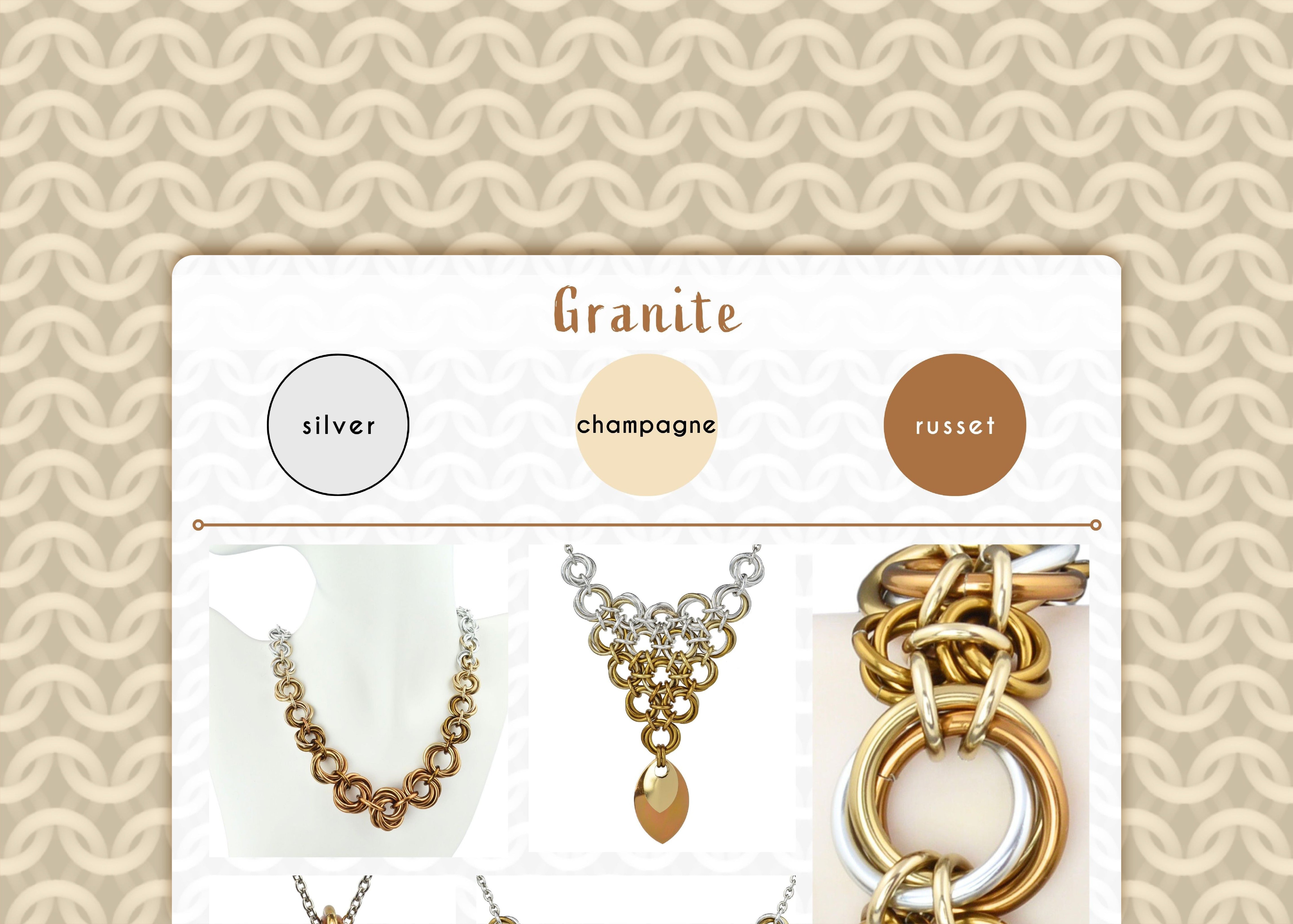
Granite Color Palette - Quiet, Elegant Neutrals
Granite is a light, understated palette of silver, champagne and russet. Silver on its own can feel very cool, but when combined with the warm, earthy undertones of champagne and russet, the result is a sophisticated neutrality that feels airy and inviting. I jokingly refer to this as the “Etsy” aesthetic – think of minimalistic white and beige images, occasionally graced by a delicate green leaf. It’s a palette that embodies peaceful simplicity.

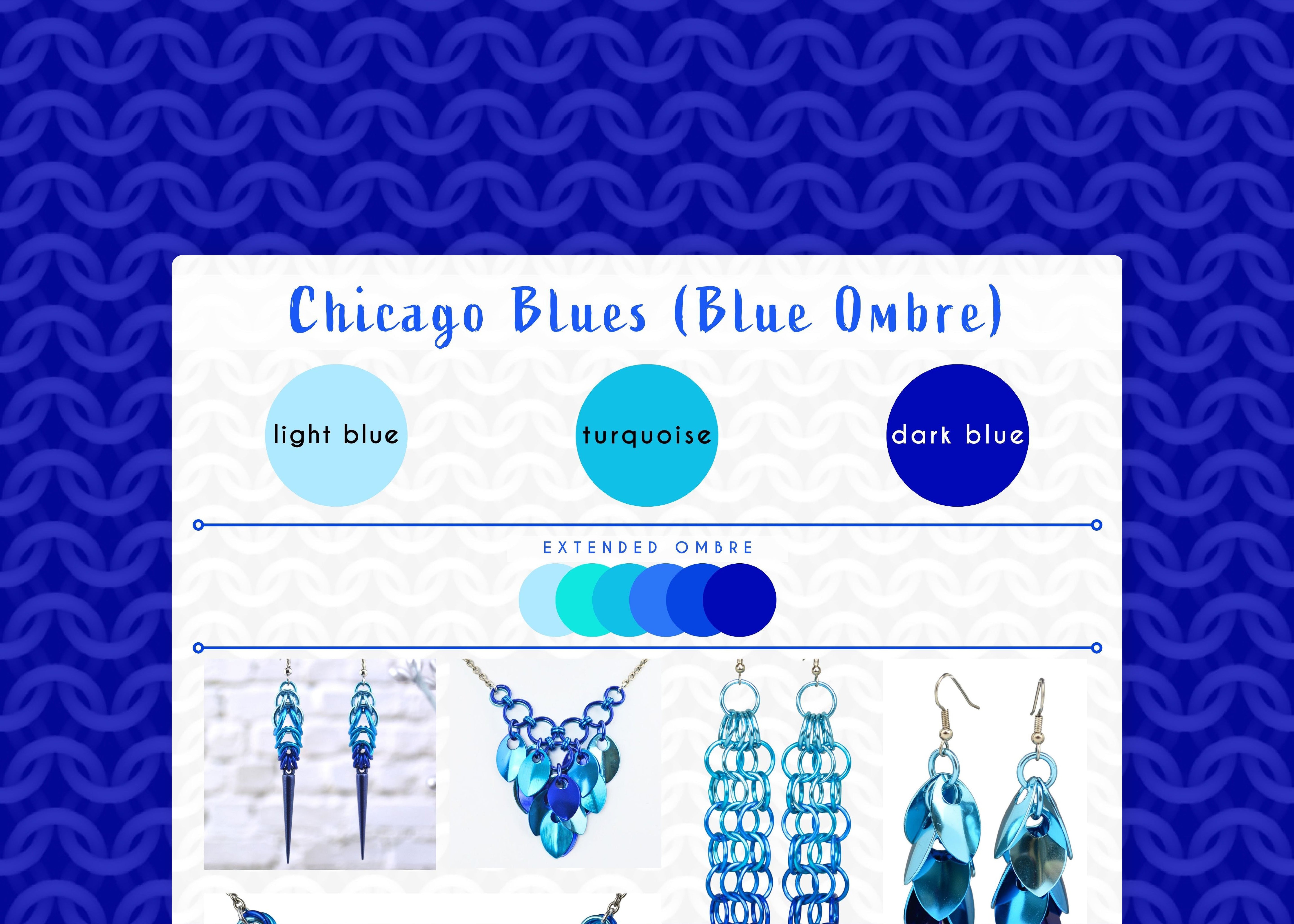
Shown in the graphic, starting from upper left and moving clockwise: Knotted Metal Graduated Necklace, Knotted Triangle Necklace, Double Knot Bracelet, Knotted V Necklace, Swirl Necklace
This palette lends itself well to creating subtle ombrés, and the colors also looks wonderful mixed together, creating cohesive and visually interesting textures. Though all the items shown in the graphic are from the Knotted Collection, I’ve also created several pieces in the mesh collection using this versatile palette.
SIMILAR PALETTES
Industrial: Consider the Granite palette the more approachable and warmer sibling to the Industrial palette, which combines cool grey and stark black with silver. Both palettes are timeless and classic, but the inclusion of black in the Industrial mix creates an assertive and high-contrast feel. Notice how the black in the Industrial palette commands attention, whereas the russet in Granite gently invites it.

Steampunk: With its focus on brown and gold, Steampunk is a warm and somewhat earthy palette, yet it is far more complex than granite. Steampunk, much like Industrial, has a “louder” visual presence compared to the quiet elegance of Granite. It embraces a more intricate and often historically-inspired aesthetic, whereas Granite feels fresh and modern in its subtlety.

CONFESSION TIME
If I just came up with this palette today, I might name it marble instead. Marble tends to be less visually complex than granite. I don’t think I fully appreciated the nuances between the two (what can I say, I’m a metal person, not a stone person!) and my research at the time led me to granite. Interestingly, “granite” hasn't proven to be a strong name for SEO (and "marble" likely wouldn't have been much better) since, of course, the jewelry pieces aren't made of actual stone. But what can I say? I like the name granite and am just going to keep on using it!
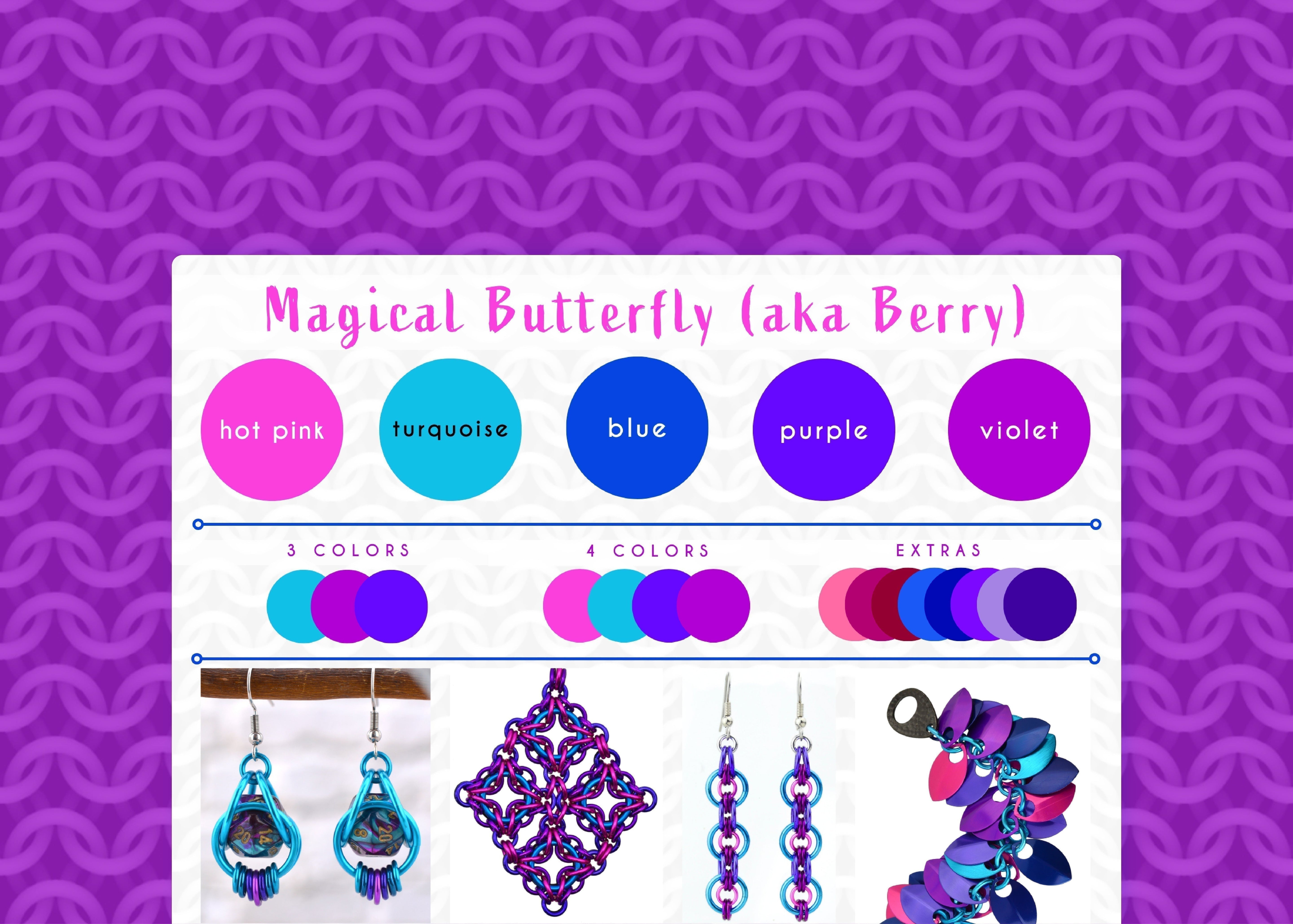
Do these subtle, grounding hues resonate with your personal style? Any item in my shop can be customized with the Magical Butterfly colorway, or you can create your own masterpiece with a custom DIY kit from Blue Buddha Boutique in this palette. Contact me and let's bring your vision to life!
Follow this series on the dedicated Color Palette board on Pinterest.
Leave a comment
This site is protected by hCaptcha and the hCaptcha Privacy Policy and Terms of Service apply.