
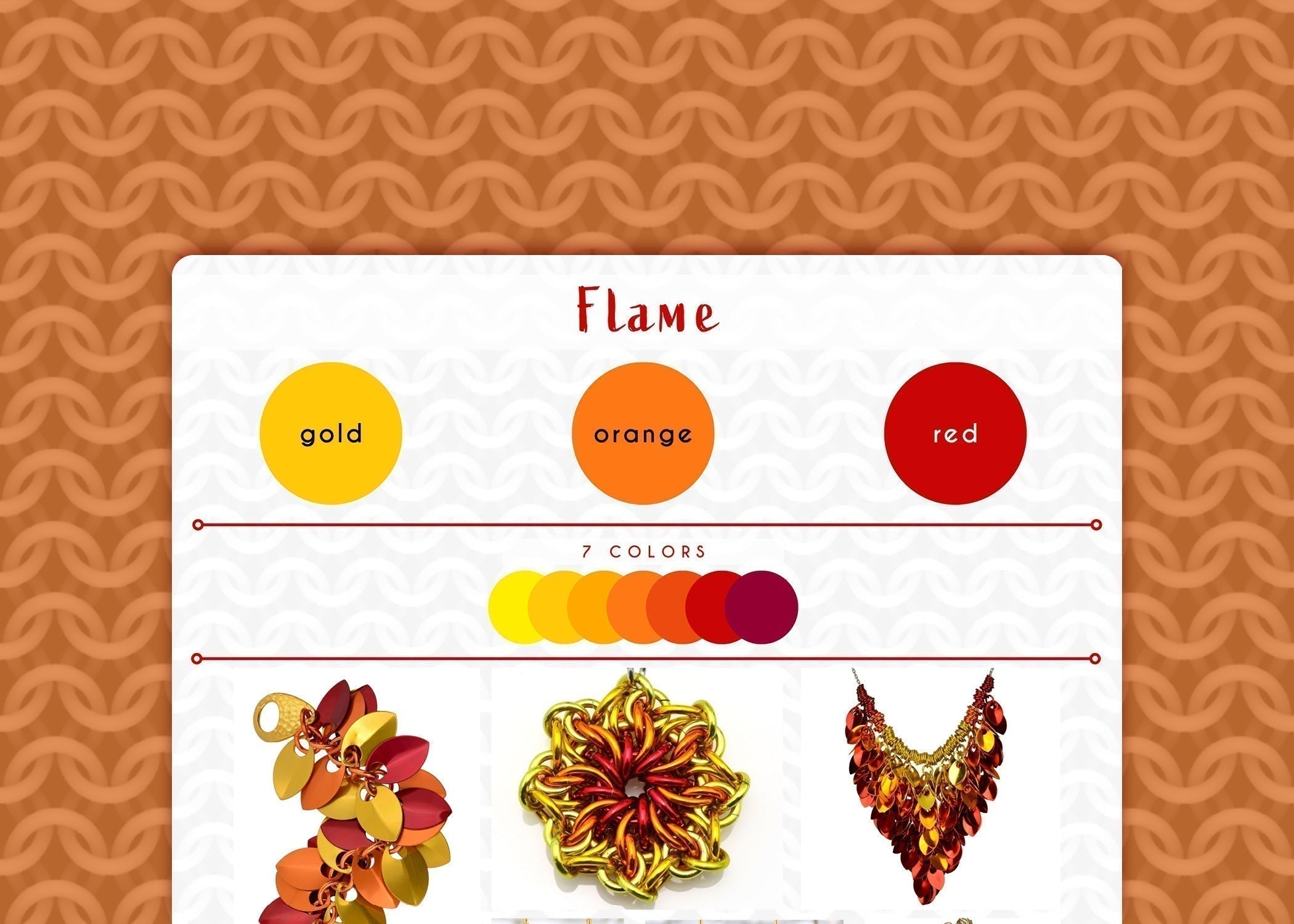
Flame Color Palette - Fire Up Your Style
The Flame color palette combines gold, orange, and red for an unmistakably fiery look. This energetic combination is perfect for those who identify with fire signs, or anyone who simply wants to make a bold statement. This is one of the most head-turning palettes in my collection. Because the hues are adjacent to one another on the traditional color wheel, this palette creates beautiful ombrés.

Shown in the collage, starting from upper left and moving clockwise: Cascading Leaves bracelet, Celestial Swirl Pendant, Cascading Leaves Bib Necklace, Knotted Metal Graduated Necklace, 7-Knot Earrings, Spike Earrings
Flame Colors
- main colors: gold, orange, red
- 7-color ombré: yellow, gold, orange, papaya, red, garnet (the ombré inserts an extra color in between each of the 3 main colors, plus one at each end)
Traditionally, most of my Flame designs use the 3-color ombré for the simple reason those were the only available colors in my early days of mailing. However, occasionally—as in both earrings shown above—I'll incorporate additional shades for a seamless, gradient effect.
Let's delve into the psychology of the three main colors.
Red: The color of passion and power, red symbolizes excitement, confidence, and even danger. This association likely stems from both our physiological responses (when we experience strong emotions, our heart rate increases and we flush) and red's high visibility in nature, where it attracts attention and has been used as a warning signal by some poisonous creatures.
Orange: A combination of red and yellow, orange is often linked to energy, enthusiasm, creativity, safety and warmth. It's an upbeat color, inspiring optimism and joy. Its association with safety is evident in its use for high-visibility gear, from hunting vests to construction signage. Orange shares the eye-catching energy of red, but has a more approachable, fun and friendly feel.
Gold: Often associated with luxury and sophistication, gold adds elegance and softens the Flame palette slightly. It creates a richer, more refined feel than bright, cheerful yellow. And to be honest, I am just not a yellow person! However, there are exceptions. For example, I wanted the the Celestial Swirl Pendant to be an unmistakable representation of the sun, and so I added yellow because it seemed more sun-like than gold. Ultimately, using yellow in addition to—or instead of—gold just depends on the piece and what I'm trying to convey.
Together, red, orange and gold create a dynamic and unforgettable palette. The fiery trio is perfect for those who love warm colors and want to express energy, excitement, and a bold sense of style through their jewelry.
Behind-the-scenes trivia:
Flame was the first ombré I ever created! I made a pair of mesh cluster earrings and thought the shape looked a bit like a flame. Naturally, I decided to see if I could capture that essence with colors. I actually have a photo of that piece, from way back in 2004! The photo is a little blurry, but you can still see the inspiration.

This photo perfectly illustrates how eye-catching the Flame palette is. What do you think? Were your eyes drawn to those little flames?
As you can see, my initial instinct was to arrange the colors just like a real flame, with yellow at the bottom and red at the top. (I can't help it, I can be very literal about things!) As I experimented, however, I found that reversing the placement and putting at the bottom felt more balanced in most designs. Red is a visually heavier color and it simply feels right to have it underneath the lighter colors. It's a small detail, but it makes a big difference.
This initial spark of creativity with the Flame ombré ignited my passion for color. (See what I did there?) It was the humble beginning of a long and ongoing exploration of color palettes and their power to convey emotions and tell stories through jewelry. I’m constantly experimenting with new combinations, and I’m excited you’re joining me on this journey!
Love these colors? Any item in my shop can be customized with the Flame colorway, or you can create your own masterpiece with a custom DIY kit from Blue Buddha Boutique in this palette. Contact me and let's bring your vision to life!
Follow this series on the dedicated Color Palette board on Pinterest.
Leave a comment
This site is protected by hCaptcha and the hCaptcha Privacy Policy and Terms of Service apply.