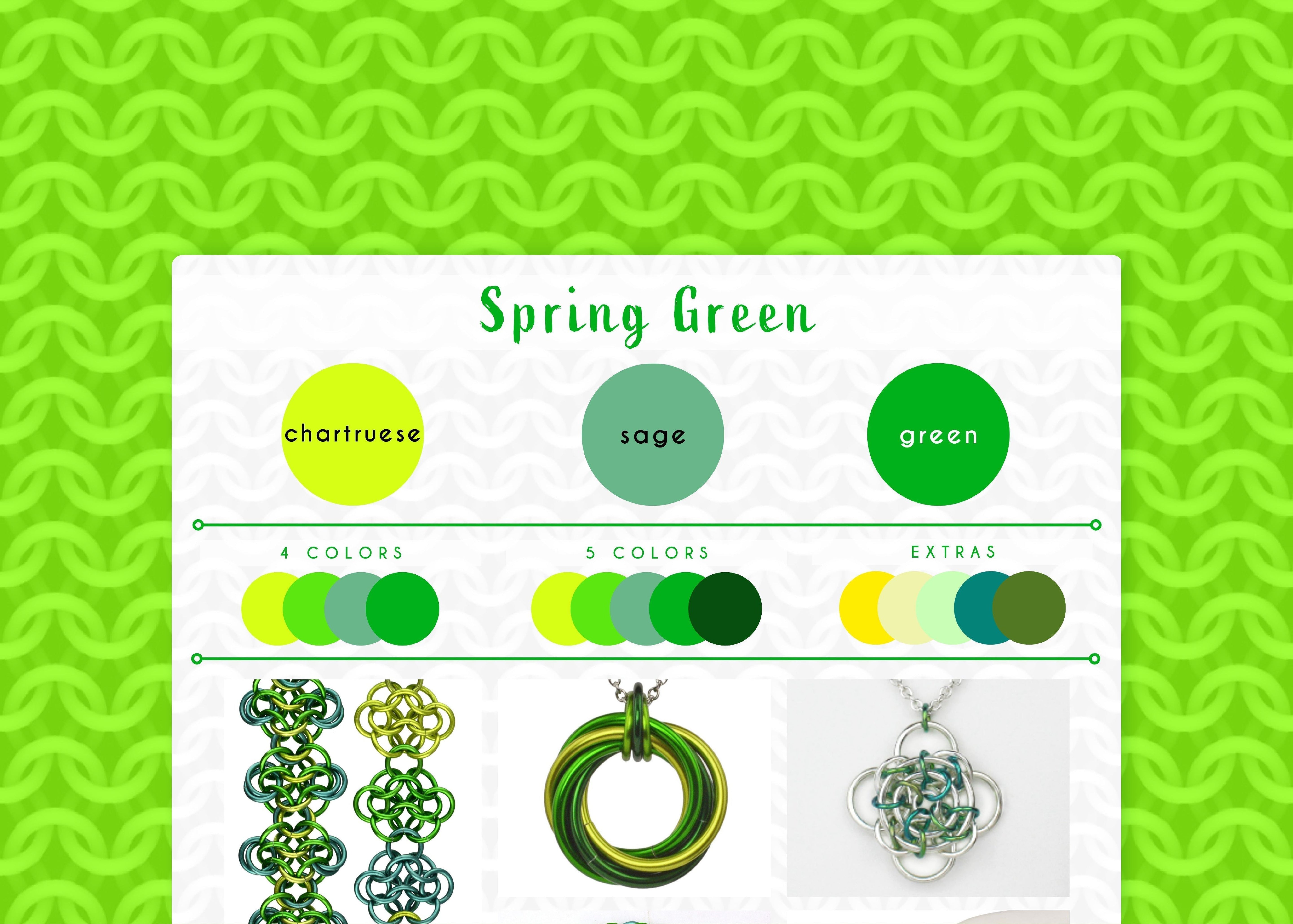
Spring Green Color Palette - Lush, Vibrant Hues
While I have a few all-green palettes, the defining color of the Spring Green palette is chartreuse - a shade of green that is more yellow than green and can be shockingly bright.
Chartreuse reminds me of baby leaves and certain kinds of algae. When I was in Chicago, I remember in early- to mid-May, all of a sudden one day everything would seem so much greener than it had the day before, as if the emerging leaves had doubled in size overnight. It always added a skip to my step, as I realized summer was just around the corner (and when I was young, that meant school was almost out for the year!) That sense of freshly arrived lushness and light, eager steps is what I’ve tried to capture in this palette.

Shown in the collage, starting from upper left and moving clockwise: Rosettes Bracelets, Swirl Pendant, Gaelic Rose Pendant, Wide Mesh Cuff, Jens Pind Bracelet
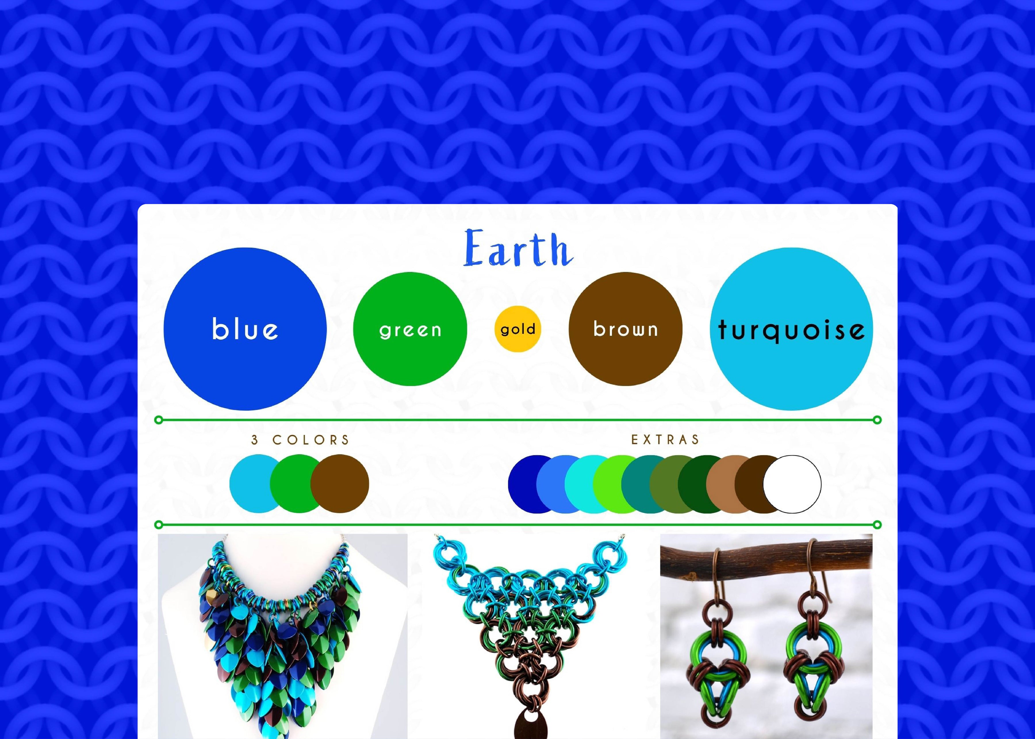
- 3-color version: chartreuse, sage, green
- 4-color version: chartreuse, lime, sage, green
- 5-color version: chartreuse, lime, sage, green, forest green
- extras: yellow, pastel yellow, seafoam, teal, olive
Green is often associated with nature, growth, and renewal. It can also symbolize hope, health, and prosperity. To me, chartreuse and lime are the most springlike greens; I’ll often use lime in this colorway as well. (The dye lots for lime sometimes lean more towards chartreuse, and sometimes more towards a true green. This variability is one reason why I've made chartreuse the main color, ensuring a distinct brightness that sets it apart from classic green.)
In the 3-color version, the vivid brightness of chartreuse is tempered by the subtle, muted blue undertones of sage, while green acts as a bridge tying the hues together. Depending on the design and dye lots, I'll occasionally add additional shades of green or even some bright/light yellows. I may add teal if the teal has a stronger green undertone than blue.
Love these colors? Any item in my shop can be customized with th Earth colorway, or you can create your own masterpiece with a custom DIY kit from Blue Buddha Boutique in this palette. Contact me and let's bring your vision to life!
Follow this series on the dedicated Color Palette board on Pinterest.

Leave a comment
This site is protected by hCaptcha and the hCaptcha Privacy Policy and Terms of Service apply.