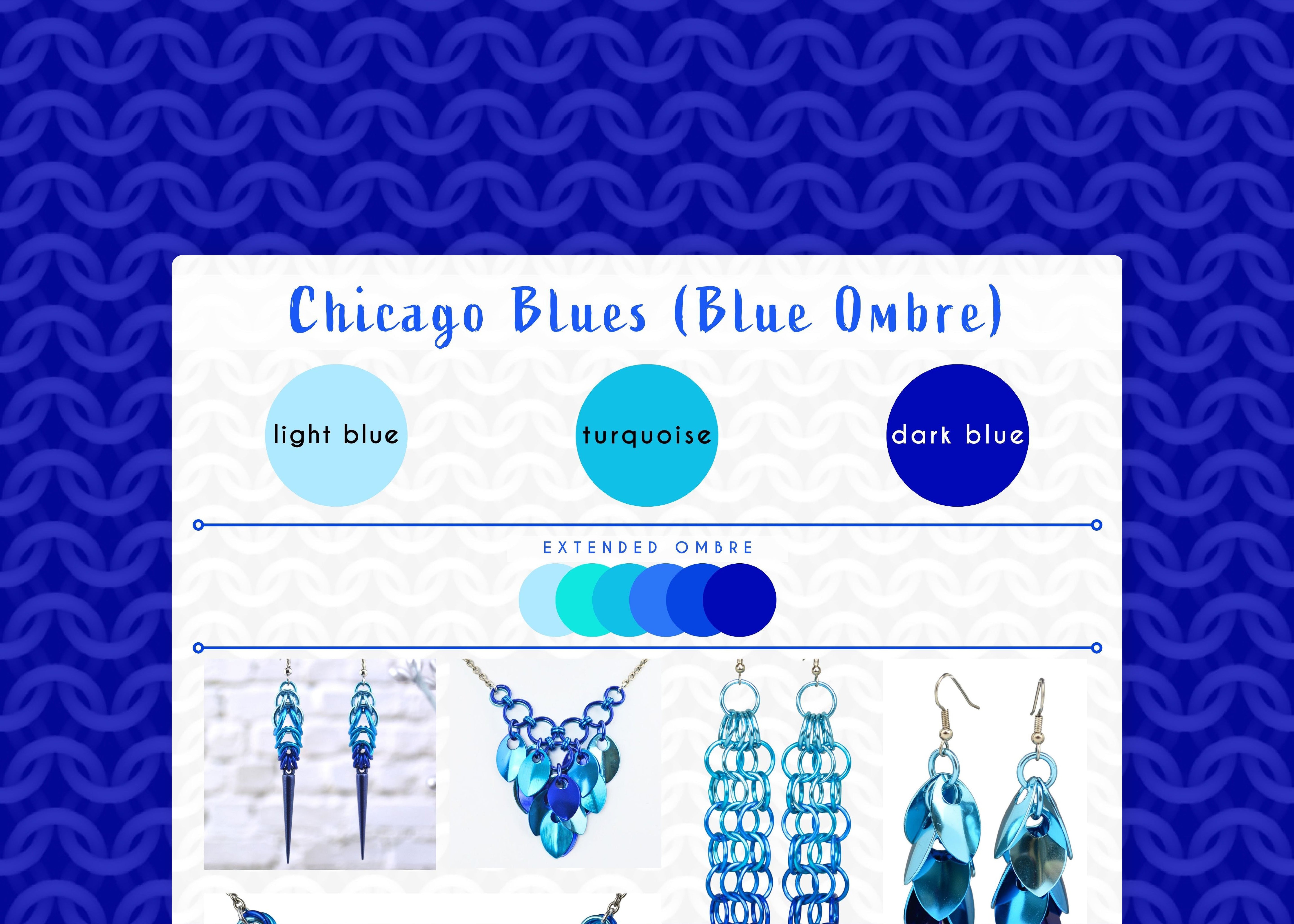
Chicago Blues Color Palette - Soothing & Vibrant Shades of Blue
The start of summer brings up nostalgic memories of lazily lying on a picnic blanket, staring up at vast blue sky while enjoying the outdoor Blues Fest in downtown Chicago. Some years the fest was chilly, sometimes it was muddy (with grey skies), but always, always the vibes were chill and happy. One of my favorite annual traditions from my hometown!
This feeling is what inspired the "Chicago Blues" color palette of light blue, turquoise and dark blue.

Shown in the graphic, starting from upper left and moving clockwise: Spike Earrings, Cascading Leaves V necklace, Long Mesh Earrings, Long Feathered Leaves Earrings, Cylon Bracelet, Knotted V Necklace
-
main colors: light blue, turquoise, dark blue
-
extended ombre: light blue, aqua, turquoise, azure, blue, dark blue
AN “IMPERFECT” OMBRE IS JUST PERFECT
Blue, at its core, is a naturally tranquil color. It evokes feelings of calm, stability, and peace. The Chicago Blues palette takes this inherent tranquility and injects it with a vibrant energy (turquoise), much like a lively blues riff can uplift your spirits. Here’s how that breaks down: The light blue and dark blue in the Chicago Blues palette are essentially the same hue, with the light blue being a tint (white added) and the dark blue being a shade (black added).
I could use azure for the center color, in order to seamlessly transition between light and dark blue. However, instead of creating a “technically perfect” ombre, I’ve opted for turquoise, which is has just a dab of yellow as an undertone. This teeny dab makes turquoise more vibrant and adds extra energy to the ombre, much like a lively blues riff makes me want to get up and dance!
EXPANDING THE OMBRE
Traditionally, most of my Chicago Blues designs use a 3-color ombre for consistency. However, occasionally—as in the Cascading Leaves V Necklace, I may add additional shades. I’ve included aqua as an extended ombre color, but the inclusion of this color really depends on the dye lot. Aqua has much more yellow than turquoise; and if the lot is very green, it'll clash too much with the blues.
MARKETING LESSON LEARNED
While I initially thought “Chicago Blues” was a clever name, it turns out it is absolutely terrible for SEO (aka getting easily found in search results on Etsy or Google - Turns out people who are looking for Chicago Blues expect music, not jewelry!) So, lesson learned! Note to self—and any other crafters who may be reading this—when naming your creations or collections, consider using descriptive keywords that highlight the colors, style, or feeling to help customers discover your work through online searches. In other words, don’t name your things like I do!
Love these colors? Any item in my shop can be customized with the Chicago Blues colorway, or you can create your own masterpiece with a custom DIY kit from Blue Buddha Boutique in this palette. Contact me and let's bring your vision to life!
Follow this series on the dedicated Color Palette board on Pinterest.
Leave a comment
This site is protected by hCaptcha and the hCaptcha Privacy Policy and Terms of Service apply.